Another humid week last week!
I don’t mind the heat but when the air is as thick as pea soup and there is no breeze I start to feel a wee bit uncomfortable and grouchy.
Luckily, my attention has been on things I can do inside in air conditioning!
As I mentioned in my previous post, I have quite a bit of glazing and firing and photographing ahead of me in preparation of the holiday season.
So this past week I glazed and glazed and glazed.
I will have enough to fill the kiln on Sunday and fire on Monday.
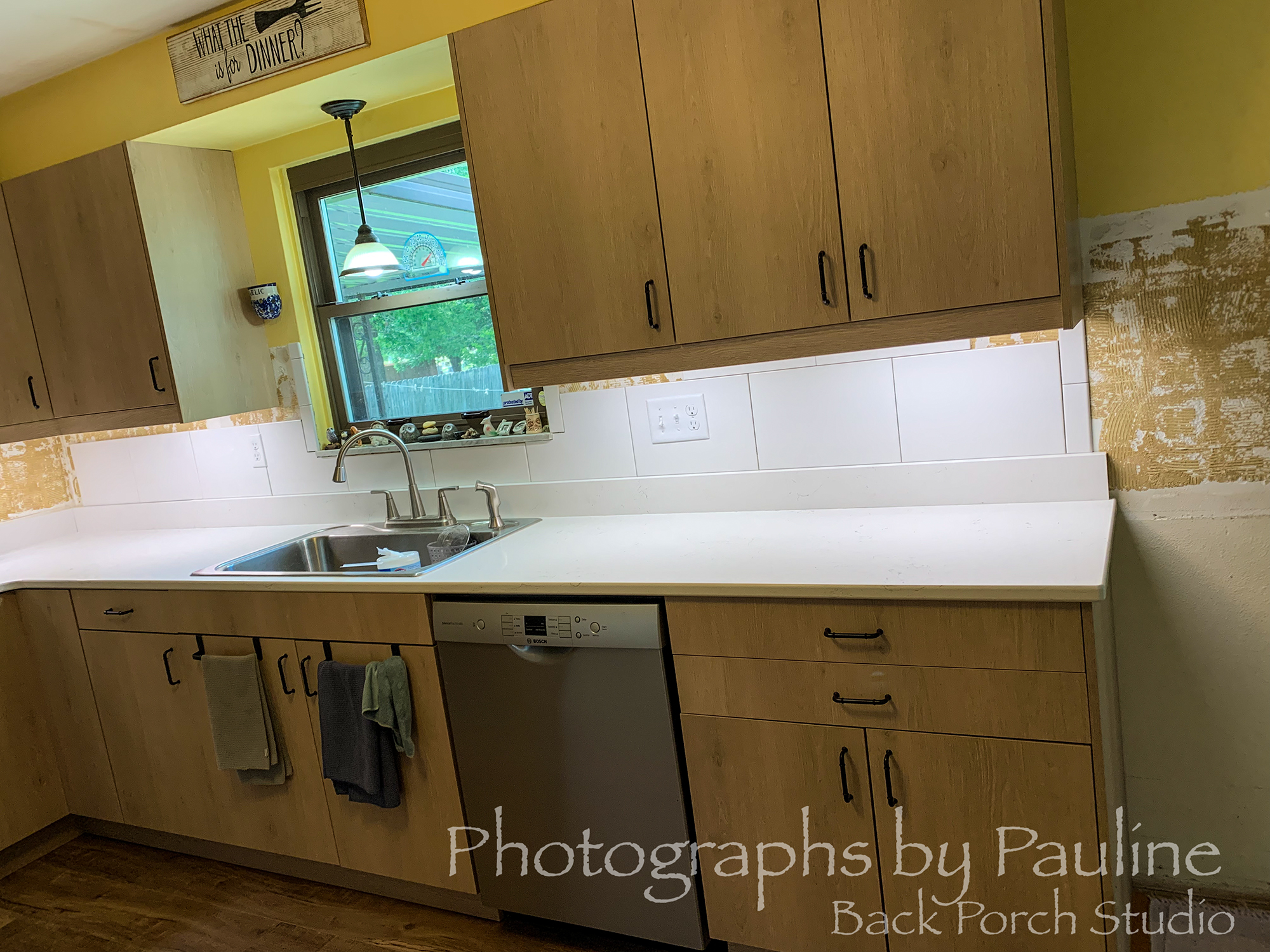
Our kitchen is coming along nicely.
Finally picked out tile for our back splash.
Dear husband is working diligently to set the tile in place.
Meanwhile, I’m looking at paint samples.
I’m just not sure the yellow goes with the new cupboards.
So, I was thinking a white paint. LOL
Oh my!
SO many shades of white!
Maybe I’ll stick with yellow after all! LOL
What do you think?
- A fresh coat of white and if so, what shade?
- or stay with the warm yellow?
- or is there an in between?
As much as I tried to stay inside last week, my picture taking of current inventory took me outside.
I find natural lighting so much better for photographing than inside man-made light.
Under the high humid conditions, it was slightly challenging.
My camera lens needed to acclimate to the high humidity and temperature of my back porch studio.
And quite frankly, so did I. LOL

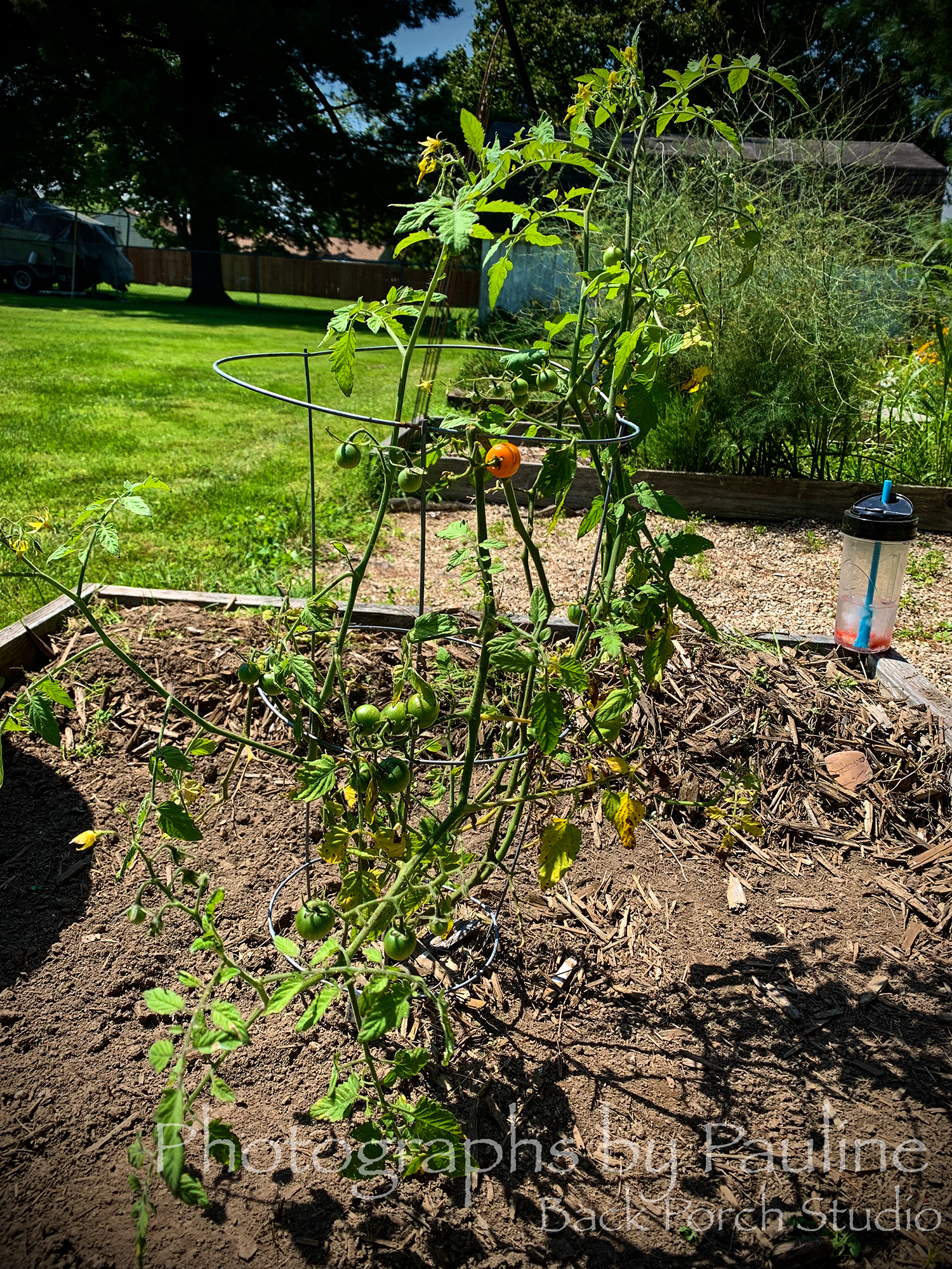
The vegetable garden was completely ignored last week.
It is not doing well this year due to lack of sun, too wet from rain and humidity, rabbits eating squash blooms and squirrels eating tomatoes.
My sad little tomato plant . . .
The sun has left and forgotten me
Hang on Little Tomato by Pink Martini
It’s dark, I cannot see
Why does this rain pour down
I’m gonna drown
In a sea
Of deep confusion
Somebody told me, I don’t know who
Whenever you are sad and blue
And you’re feelin’ all alone and left behind
Just take a look inside and you’ll find
You gotta hold on, hold on through the night
Hang on, things will be all right
Even when it’s dark
And not a bit of spark
Sing-song sunshine from above
Spreading rays of sunny love
Just hang on, hang on to the vine
Stay on, soon you’ll be divine
If you start to cry, look up to the sky
Something’s coming up ahead
To turn your tears to dew instead
And so I hold on to his advice
When change is hard and not so nice
You listen to your heart the whole night through
Your sunny someday will come one day soon to you

Go to the paint store and pick out all the colours you like on those handy little paper scraps. Stick them on the wall in various places – light, dark, in between.
Over the next days or so look at them in the daylight, at night, with lights on and off… Remove the ones that irk you. 😎
It’s best to leave them up for a few days…
They have many beautiful shades of white these days. My mom has a cement shade of white that’s quite pleasant. You can get hues that have hints of blue, green, yellow… it’s very subtle.
I like my yellow/green/grey shades called Garden Stone (Benjamin Moore), which might be too bright for your kitchen (my cabinets are white) but they have lighter and darker versions.
That is one sorry looking tomato plant. I had a good harvest on the one plant but each tomato imploded and was uneatable so I don’t know what happened…
The cherry tomatoes turned out a bit better. 🤷♀️
LikeLiked by 1 person
Just back from the local paint store with a handful of white paint samples! I can see already which ones are too red, blue and green. Looks so different in the store. I will tape the rest up as you mentioned and study them this week. 😉
Yes, the poor tomato plant just can’t catch a break from the weather or squirrels.
LikeLiked by 1 person
Thank you for that uplifting poem In the middle of the poem there’s a line, “hang on to the vine.” Brought to mind John 15:1-8 in the Bible where Jesus calls himself the Vine. I’m so thankful that with him, all things DO work together for good (Romans 8:28). P.S. I hope you find the perfect creamy yellow-white paint that compliments your lovely new cupboards!
LikeLiked by 1 person
Thank you Nancy. I am narrowing down my choices! 😄
LikeLiked by 1 person
…“hang on to the vine”
I caught that too! 😉
LikeLiked by 1 person